
Exploring the best in sound, music and storytelling from all around the world.
This interview is the third part of a series of episodes written and created by Sophie Sound.

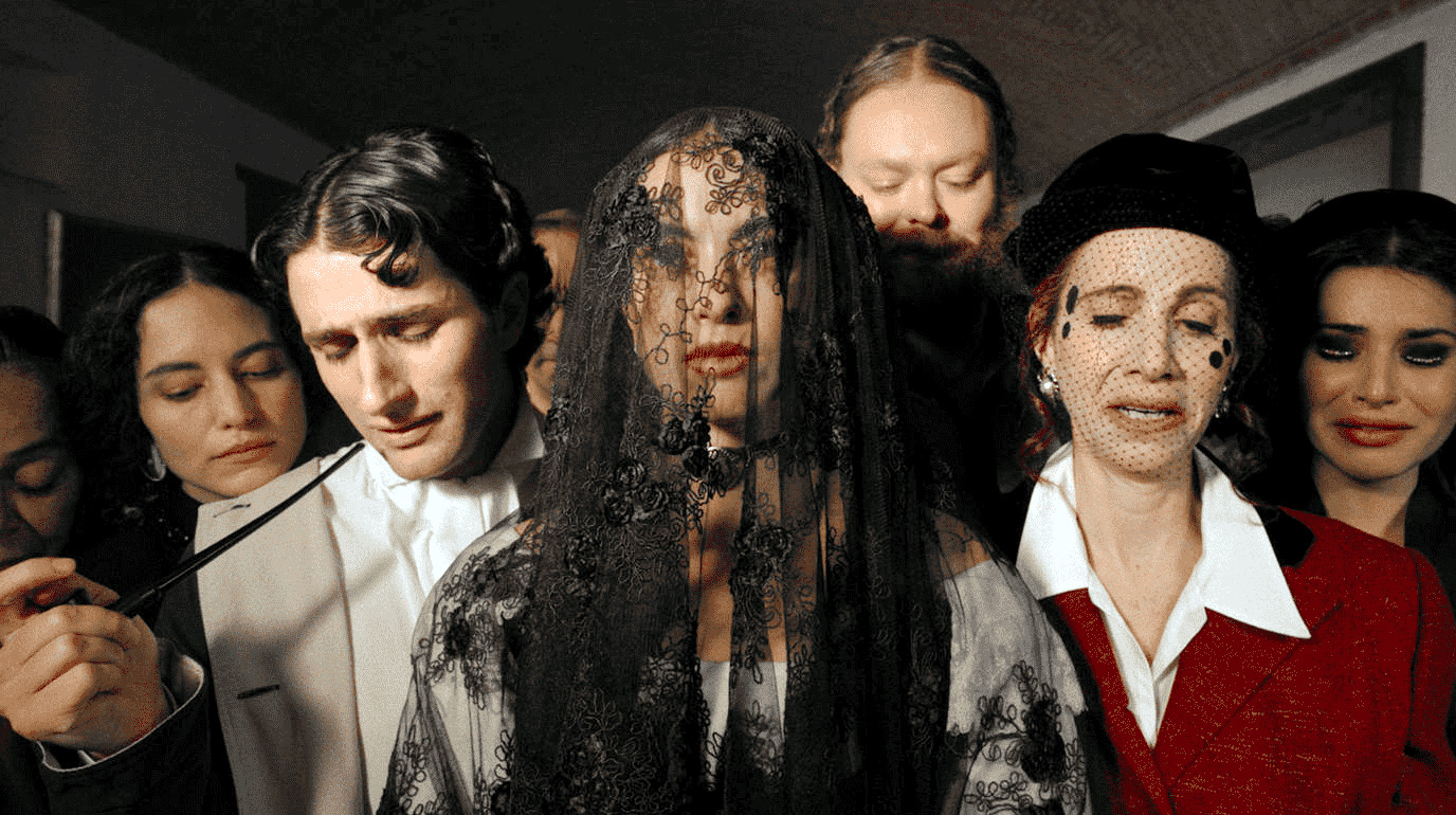
Adrián: Our main reference for this sequence were the engravings of Leopoldo Mendez. The beauty of the composition invited us to reproduce it exactly in this case. In terms of lighting we wanted to darken the background, creating an image of superimposed layers, without perspective like violence itself. The women and children in the background are illuminated with a spotlight in order to denaturalize that reality as if the image represented a memory or an abstract imagination of the event itself.
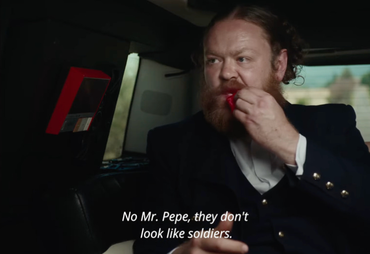
The camera does not move in this shot, it is the character, Pepe in this case, who moves into the shot by answering the phone and in doing so corrects the composition of the frame. This strengthens the idea that the checkpoint and the robbery are planned by Pepe to propose to Constanza and maintains the sarcastic tone of the movie.
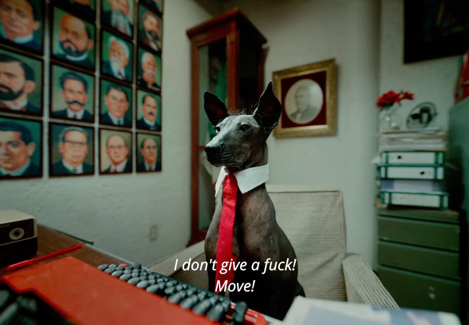
All the colors in the frame are those of the Mexican flag and the portraits on the wall are all the presidents of Mexico. Ana Ibarra “Moshi” the production designer did an excellent job in the movie. I framed Nacho with an angular lens humanizing the character as if it were a regular officer. Lighting the office with fluorescent lights, with a slight green tint, which reinforces the idea of the typical bureaucratic shabby office.
Sophie Sound: What I really like about the images in every frame was the costumes that symbolised a time and the colours being very modern because the story and humor specifically seemed to me very accurately displayed when it comes to Mexican culture. So this mix of symbolic meaning hooked me straight away. I'd love to hear your opinion and thoughts on the mix from your perspective and understanding?
Adrián: The idea was to create an anachronic atmosphere: Period costumes, classic makeup, iphones and limo’s. It's super kitsch and pretentiously cool yet is this mannerism that seeks out empathy through the most shameless parody. Underscoring as a mockery that we are still living in a Neo-colonial Novo Hispanic country where coolness and lushness is a seal of approval for the higher classes.
Santi came from the beginning with the idea of creating a hyperbolic tone that invited the spectator to dive into a strange yet familiar experience. It is Dante’s “Divine Comedy” overloaded with Mexican elements and humor. Pepe goes to hell, the purgatory and comes back to Constanza free from sin as a little boy in a boat. A plot like this needed to be told in a fantastic way. Something we agreed on right from the start is that this movie was not supposed to be naturalistic at all. As a parody of the Mexican oligarchi’s despotism, the film had to use excessive elements.
We watched many silent period films like Murnau’s and Fritz Lang’s. They used light as a powerful narrative element by using lights and shadows in order to express an emotion visually. Our work was very much influenced by that kind of lighting and framing. We thought that it could be fun to mix German expressionism with Mexican soap operas.
Drawings, books and paintings of the New Spain era were very present in the research. Maximilian of Habsburg and Carlota’s portraits as well in terms of costumes, colors and how backgrounds were lighted. The work of Luba the costume designer is remarkable, she even handmade some of the costumes.
Sophie Sound: I'd be interested as well in hearing what you learned and connect with the colours you chose for the different characters and parts of the story. It seems to me you used some colours and turned them up so much to be come a parody of their own meaning. The red for example?
Adrián: We wanted the red itself to suggest anger, lust, corruption and violence, everything that Pepe represents. Red color is always there when something bad is happening. Colors are very saturated analogically by the art department, but even accented in the color grading process. We shoot digital but Claudio Güell, the colorist, proposed a digital bleach bypass, by overlaying two nodes: one in color and the other in BW so you get a very contrasty and desaturated image, then we oversaturated by selecting the different colors we wanted, creating more volume and difference between colors.
Working with Santiago Mohar is amazing, because he encourages you to go beyond your own limits. For purgatory he was clear that the light and colors had to be strange, during the shooting he would look through the camera and look at me with a biting smile as if asking: is that all you have? During the color grading process he asked to add purple masks in the sky for the purgatory scenes. Like an enthusiastic orchestra conductor on his fit, touching the screen of the cinema room. Claudio and I were fascinated.
Sophie Sound: What can colours and the poetry of cinematography do for cinema?
Adrián: It’s always fun to work with colors, you can directly communicate with the spectator and create a code that works just in that world. There are limitless resources, it is the selection of them and its juxtaposition that makes a movie interesting. However, not everything has to have a meaning, sometimes it just works aesthetically.
In my opinion cinematography is there to help tell the story. To create an atmosphere and tone that accompanies the narrative. But it is the scriptwriting, the editing, the actors and the decisions of the director that has to be well tied up for the movie to work. Cinematography goes in a parallel path, emphasizing the plot through ideas.

Adrián: In my opinion one of the essentials as a cinematographer is to talk the same language with the director and to translate these ideas into the technical needs and tools. I was lucky we had time to make tests with actors, costumes, art, lighting and camera. I was able to study what kind of lighting, equipment and camera angles fit with the different characters and costumes. Lucia Gomez-Robledo (Constanza) has a very white skin, at least one stop brighter with the rest of the cast. I used that on my behalf but sometimes I had to use black scrims to reduce light on her face.
We liked the 1:43 open gate ratio with no crop. I really liked it because it is wider than the classic 1:33 and by not cropping it gives a feeling of working with a larger canvas. The Arri Signature are so perfect and organic that I didn’t use any diffusion glass to soften the image, that level of sharpness and non deformation fitted perfectly for the plasticity of the film. We probably shot half of the movie with the 47mm lens which, in Full Frame, is still wide enough while maintaining an elegant separation between background and character, perfect for portraits and tableaux vivants.
In terms of lighting I used a lot of the CRLS Light Bridge system which is a series of mirrors with different textures and technology where you can bounce light from one to another, with only one or two light sources. It is a fast and effective way to set up a scene. You can create spotlights, which I did a lot, with different beam diameters and textures without the need of setting up many flags.
Sophie Sound: “Colors are the perfect hiding place for significance.“ What are the colors in Images of movies that had the biggest influence on you?
Adrián: I loved Alice Rohrwacher's “La Chimera”. Hélène Louvart feels so intuitive and accurate, she creates a wonderful world with a very attractive aesthetic, wonderful color palettes and tones. I always follow her work.
I think the Italians know very well how to work with color, it is in their blood. Vittorio Storaro and Bertolucci did a masterful job with color in “The Last Emperor”. There is a wonderful analogy between the life of Puyi and color. It starts with him cutting his veins, we see red and go into a flashback to his birth, connecting red with the beginning and end. Then everything is tint in a warm orange as the family color. We see yellow when he is presented as an emperor, the color of the sun. Green when Peter O’Toole the english teacher comes to the forbidden city with a green bicycle, the color of knowledge. Blue with luxury, love and deception. Purple when the revolution comes. If you picture the color wheel all these colors go in order.
I believe that the cinematic language is free, no colors or elements means nothing in particular, as storyteller you have to create the meaning of each element in the particular universe of each film.
Adrián Cores del Rio:
His debut feature film as camera operator, "Los Muertos" selected to represent Mexico in the Oscars 2016, premiered at the Festival Mar de Plata. Adrian's recent DoP credits include work on,"Historia Minima de la Bici" Documentary film premiered at New York Cycle Film Festival and SPOO Int Film Festival, "Rayo" tv Series (2019) “La Función” (2021) won the award for best fiction film at the Calella international Film Festival, the documentary “El Juramento” (2023) filmed in Kenya and “A Story of Love and War” (2023) which was released at the Rotterdam International Festival.